Thursday, December 6, 2018
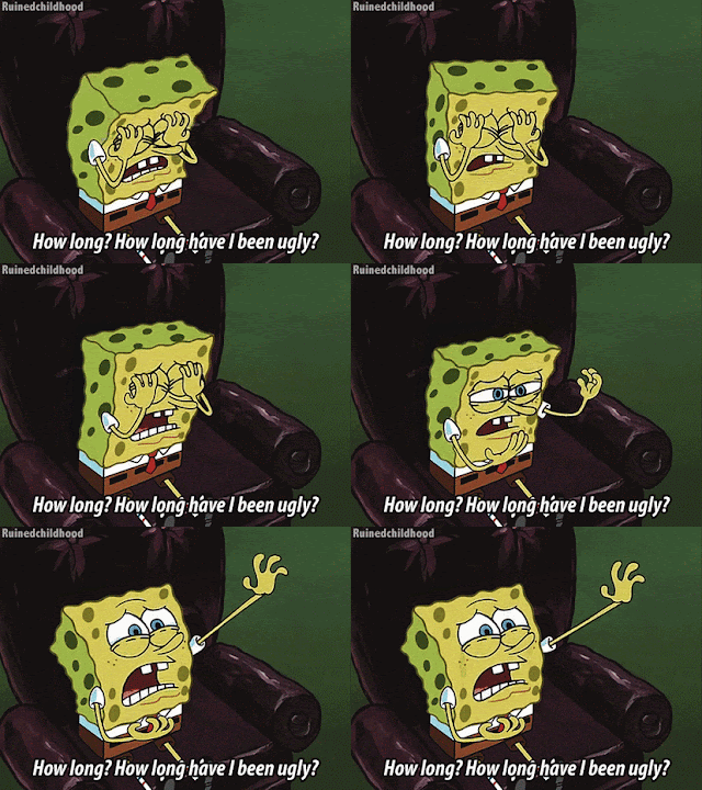
I'm Ugly and I'm Proud!
I've had a hard time with my Ugly Sweater post for the Baseball Every Night contest. I know I've come across plenty of cards in my time that were just downright ugly. It's been hard, though, to recall them from the depths of my memory, where they have been banished. There are a few that come to mind, but I'm still not sure that they qualify as the ugliest card I own or have seen. Still, let's have a gander.
Interestingly, I have four cards to show in pairs. The first two are both football and have a similar theme: the hair.
Both of these cards frightened me a little when I was a kid. I remember having the James Wilder card in my collection as a youngster, and I always wondered why his hair looked green. There is a greenish tint that is not like a hair-dye hue. This looks more like a patch of moss growing from his head. Along the years, I lost the card somehow. Then I started building the 1988 Topps set last year, and when Wilder returned to my collection, I noticed his hair still looked green. So it wasn't just a printing error for the copy I owned. I still can't explain it. Mark Murphy, on the other hand, might welcome some hair. Once again hearkening back to my younger years, I was a little scared by the wrinkly, veiny scalp on full display. I hate to make fun of anyone's appearance on a card (Heaven forbid my likeness ever ends up printed on cardboard and distributed to the masses), but this one haunted my 9-year-old brain.
The other two are baseball cards, and they're both drawn cards.
Peter mentioned in his post that Donruss often screwed up Diamond Kings, and I have to agree. Just look what they did to Gracie! He looks like a Picasso, and I don't mean that it's a masterpiece. The most egregious part is probably the straight line running down his cheek. I'm not sure what's going on with Matt Dominguez here. It doesn't even look like they tried to make him look like a person. I know that this set really didn't put forth too much of an effort to capture the likeness of the player portrayed, but this one looks insulting. And it's not consistent with the rest of the set, either. It's like the artist singled out Dominguez. That half-bull, half-giraffe neck is crazy. My kids love this card, by the way. I don't.
There are probably other, uglier cards in my collection, but these are the ones that stayed in my mind as I thought about the topic. Thanks for the contest, Peter. I hope you are all enjoying the sight of ugly cardboard this holiday season.
Labels:
Contest
Subscribe to:
Post Comments (Atom)


The Matt Dominguez should be the card for your entry!
ReplyDeleteThat Dominguez card is truly terrible. Wow.
ReplyDeleteHeinous, man. Dominguez should have filed a defamation lawsuit or something. And I'm so so so so so glad that I'm not alone in disliking (some of) DK. Looks like he had a sunburn or something. Just awful. Thank you so much for contributing!
ReplyDeleteThat Murphy card always freaked me out. There were some unflattering photos in '88 Topps, but I dont think I ever noticed Wilder's greenish hair. I remember there was a Bobby Humphrey card sometime around 1991 that looked like he had some icky goo in his hair.
ReplyDeleteAlso, Triple Play is an abomination, especially that Dominguez.